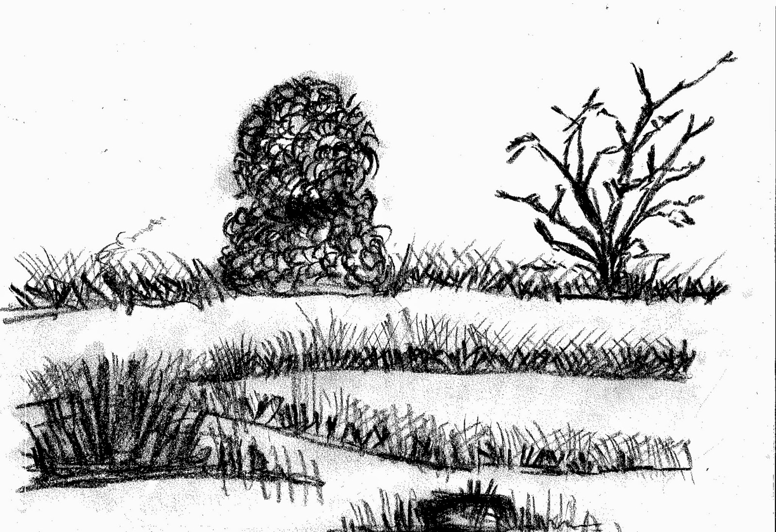
After exploring various visual styles, non of which that resonated with me, I decided to go back to my basics : Charcoal. When it comes to Charcoal as a medium, it comes naturally to me and i have a steady hand. where as after exploring with this medium my critic to myself would be, that i need to explore various stroke styles for leaves and bushes etc.
After exploring the different imagery from the habitat, I sliced these images up and tried putting them together into a layout, where i could explore the relationship between text and image.
In the first one, the charcoal lapwings are getting rather lost in the black and white.
the second one compared to the third one, the largest lapwing being an image is giving a good balance in terms of contrast.
so the third one is working the most, and the overall critic is that, the outlining needs more refined and cleaner strokes. the image of the grasslands needs more detailing, needs to be more crisp and the strokes of the bushes and trees can get better, also the outlining of the smaller lapwings can be more prominent too. The type can also get more playful in terms of layout


.jpg)
No comments:
Post a Comment